Impilo
Branding Logo Design
What Is IMPILO?
IMPILO means life, health, and well-being — and that is exactly what our brand stands for.
At its core, IMPILO is a celebration of natural vitality. Rooted in African heritage and inspired by generations of traditional herbal wisdom, IMPILO was created to support the body in the most natural way possible — through carefully selected herbs and plant-based ingredients.
We believe that true wellness begins with balance. Long before synthetic supplements and chemical formulas, communities relied on the power of nature to strengthen immunity, restore energy, and maintain overall well-being. IMPILO continues that tradition — blending time-honoured herbal knowledge with modern nutritional understanding to create formulas that support everyday health.
The Power of Natural Herbal Support
Nature provides a rich source of nutrients, antioxidants, and plant compounds that work in harmony with the body. IMPILO herbal formulations are designed to:
• Support immune function
• Promote natural energy and vitality
• Provide antioxidant protection
• Assist overall wellness and balance
Unlike harsh synthetic alternatives, herbal ingredients work gently and holistically. They nourish the body rather than forcing it, supporting long-term health instead of quick temporary fixes.
Inspired by African Heritage
The name IMPILO reflects a deep connection to African identity — where health is seen as a balance between body, mind, and nature. Our approach respects this philosophy.
Each formulation draws inspiration from traditional herbal practices while meeting modern quality standards. We combine authenticity with science, ensuring every product is safe, effective, and carefully crafted.
More Than a Supplement
IMPILO is not just a product — it is a commitment to natural living.
It represents:
• Trust in nature
• Respect for tradition
• Strength through balance
• Wellness rooted in heritage
We believe that when you nourish your body with natural ingredients, you invest in a stronger, healthier future.
IMPILO — Life, Naturally.
The BRAND
IMPILO is rooted in the meaning of life, health, and well-being. Our herbal formulations harness the power of nature to support everyday vitality and balance.
Brand & Design Introduction – IMPILO
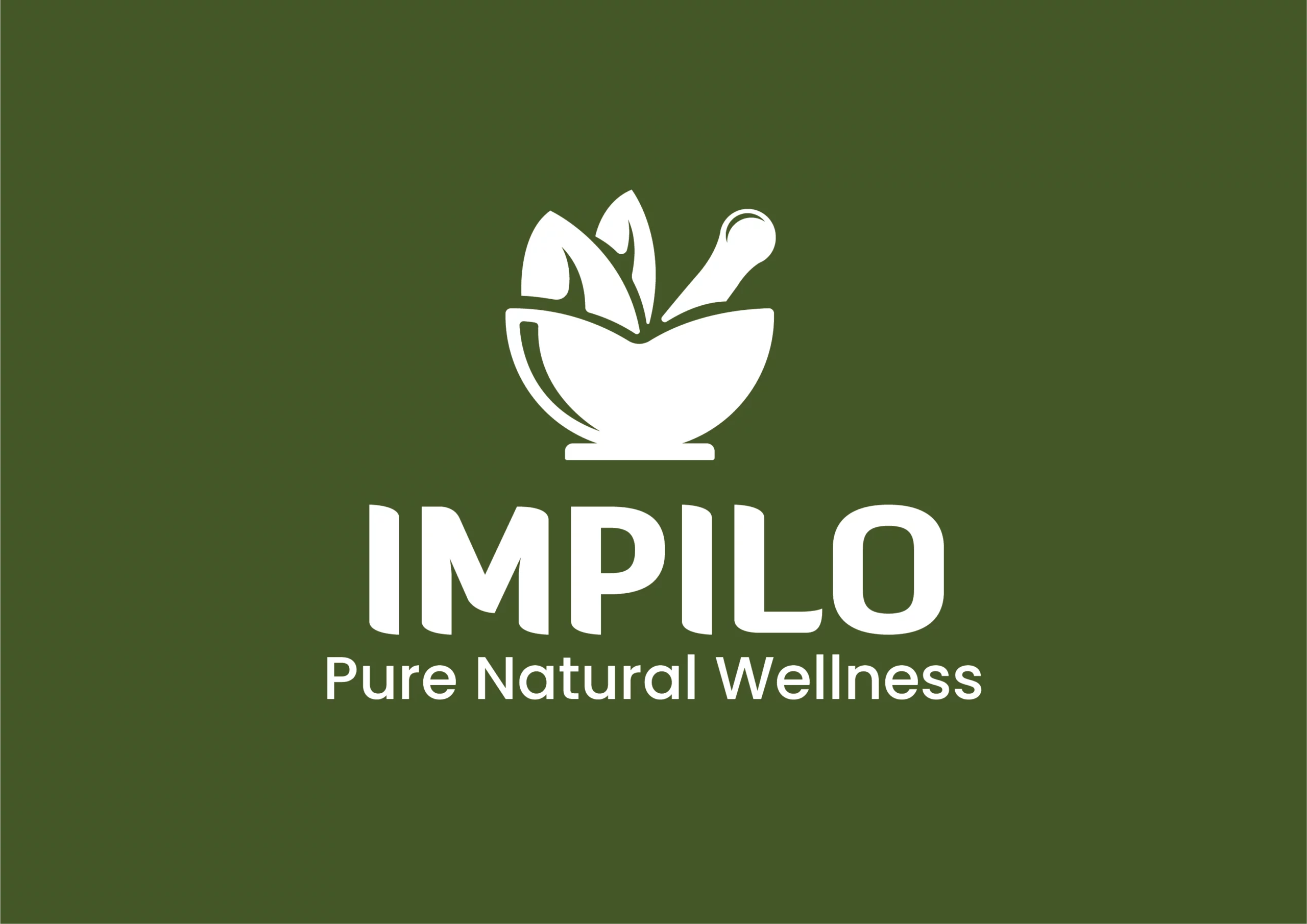
The IMPILO brand identity is built around simplicity, strength, and natural authenticity. At its core, the logo features a minimal mortar and pestle with two leaves — a timeless symbol of traditional herbal preparation and natural healing. The silhouette is clean and geometric, allowing the mark to feel modern while still honoring heritage. This balance between tradition and contemporary design makes the identity both culturally grounded and commercially relevant.
The use of flat, solid shapes ensures the logo is highly versatile. It works effectively across packaging, digital platforms, signage, and merchandise without losing clarity or impact. The bold uppercase wordmark reinforces confidence and stability, while the rounded forms subtly echo the organic curves of the mortar icon. Together, the elements create a visual language that is simple, memorable, and strong.
The brand’s colour palette is intentionally rooted in nature and African earth tones:
• Deep forest green represents life, growth, vitality, and natural healing. It immediately communicates herbal wellness and trust.
• Warm terracotta / earthy red-brown reflects African soil, tradition, and strength. It adds cultural warmth and authenticity.
• Muted gold / beige tones symbolize nourishment, quality, and a sense of premium value without appearing overly corporate.
These colours work together because they mirror natural environments — soil, leaves, sunlight — which subconsciously reinforce the brand’s commitment to plant-based wellness. The combination also stands out strongly on shelves while maintaining an earthy, grounded presence.
The green conveys health and safety, the terracotta adds warmth and heritage, and the gold accent introduces subtle premium positioning. The result is a palette that feels both trustworthy and culturally relevant.
Design System & Consistency
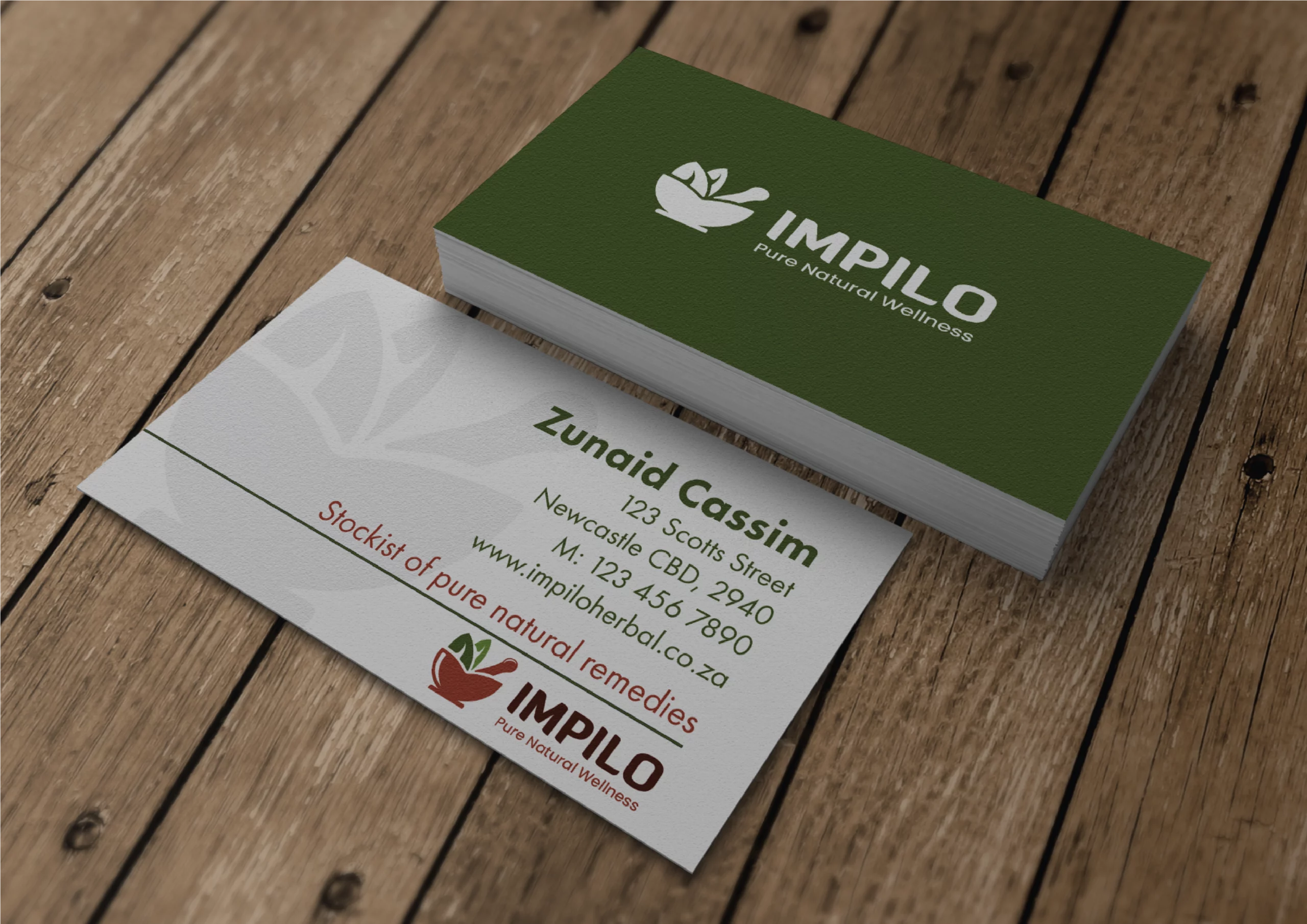
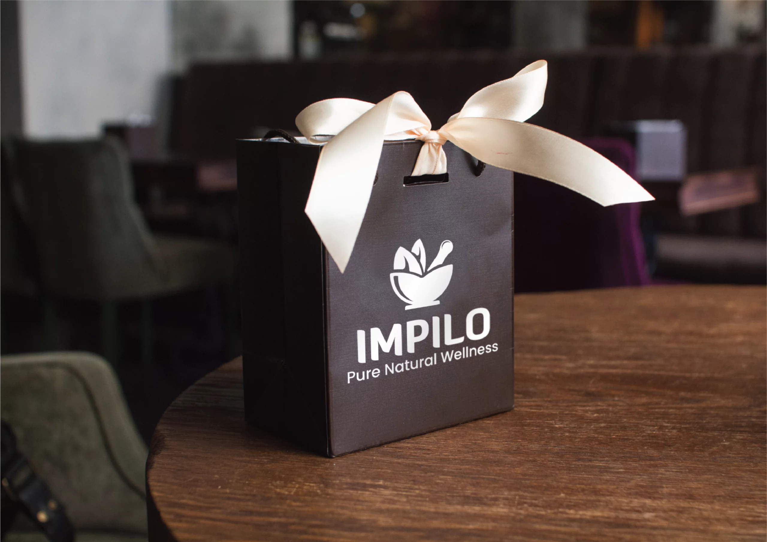
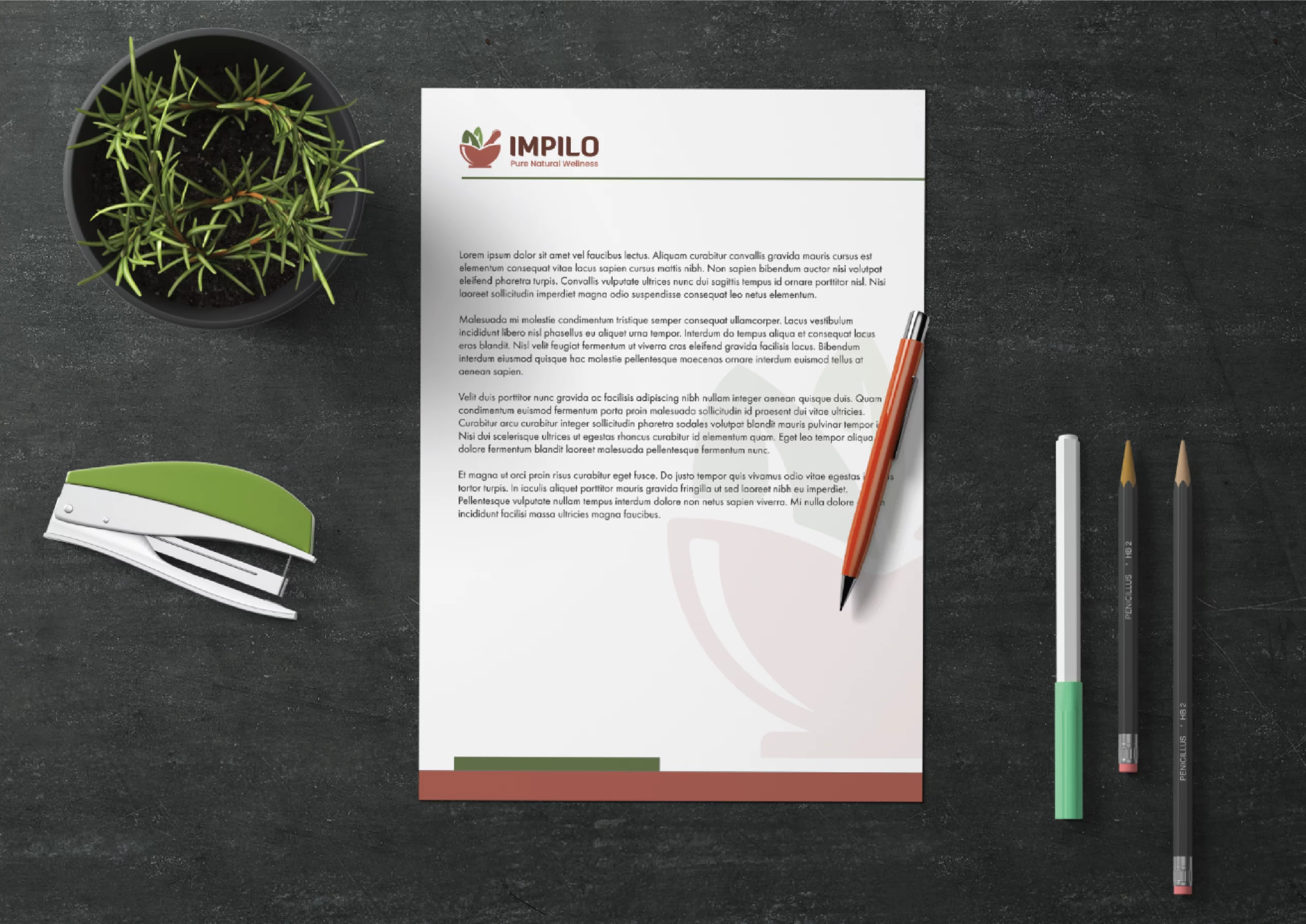
Across packaging, digital mockups, signage, and stationery, the visual system remains consistent:
- Strong central icon
- Clean typography
- Textured African-inspired backgrounds
- Natural imagery (herbs, botanicals, landscape elements)
The textured backgrounds add depth and storytelling without overwhelming the clean logo. They connect the product to African landscapes and traditional knowledge, enhancing emotional resonance while keeping the core brand mark modern and controlled.
This layered approach — minimal logo + rich contextual backgrounds — allows the brand to feel premium and grounded at the same time.
Why the Design Works
The IMPILO identity works because it is:
• Instantly recognizable
• Culturally authentic without being stereotypical
• Modern yet rooted in tradition
• Strong enough for shelf presence
• Flexible across print and digital
The simplicity of the mortar silhouette makes the logo scalable and iconic. The bold typography ensures readability and authority. The earthy palette reinforces the natural herbal positioning.
Most importantly, the design avoids clutter. In a market where many herbal products feel overly busy or overly clinical, IMPILO achieves a rare balance — it feels natural, strong, and refined.
Uniqueness of the Brand
What makes IMPILO unique is the fusion of:
-
Minimal contemporary design
-
African heritage influence
-
Herbal authenticity
-
Premium presentation
Rather than leaning fully traditional or fully pharmaceutical, the brand occupies a distinctive middle space — modern African herbal wellness.
The result is a visual identity that feels purposeful, culturally aware, and commercially strong — a brand that reflects the meaning of its name:
IMPILO — Life, Naturally.